App redesign & digital credit card onboarding
Viseca one
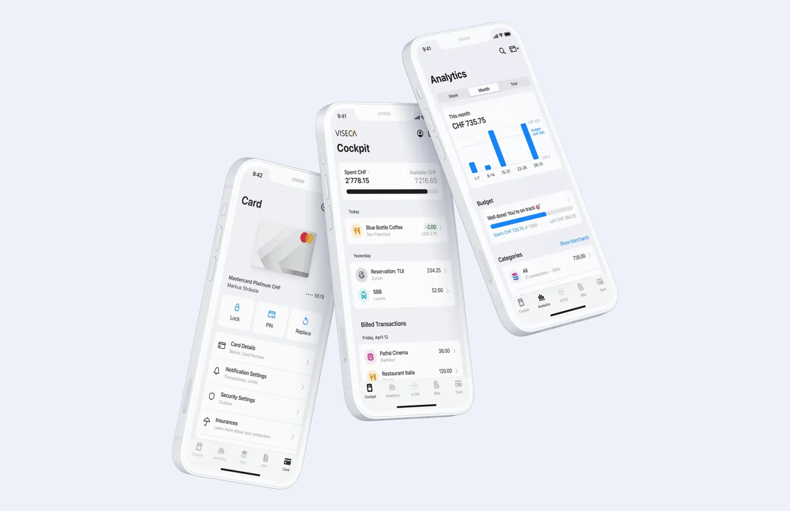
As UX Design Lead I spent three years owning the redesign of the Viseca one apps for iOS and Android – 2 million users – and designed the digital onboarding for the Cumulus and Manor credit cards.
- Role
- UX Design Lead
- Period
- 2021 – 2024
- Platform
- iOS · Android
- Team
- Lead + 2 designers, product, engineering
- 2 Mio.users
- 2platforms: iOS and Android
- 2designers led
- 3years owning UX/UI
Context
An app two million people rely on every day.
With Viseca one, cardholders manage their credit cards: checking transactions, approving online payments, blocking cards and keeping track of bonus points. At this scale every bit of confusion becomes a support call – and every good decision is felt.
The redesign had two goals: make an app that had grown over the years modern and native on both platforms, and enable a new line of business at the same time. Credit cards such as the Cumulus and Manor cards were to be applied for entirely digitally.
It mattered a lot to us to take both platforms’ guidelines seriously. An iOS app that looked almost the same on Android became an app that follows Apple’s Human Interface Guidelines on the iPhone and Material Design on Android – one shared brand, but familiar patterns for navigation, controls and system behaviour.
My role
Responsible for UX and UI – from the first question to release.
-
End-to-end UX/UI ownership
For both apps and the digital onboarding, in close collaboration with product owners and engineering.
-
Research & usability testing
Planning, running and synthesising – so decisions rest on observations rather than opinions.
-
Design library
Building and maintaining the components for iOS and Android – shared foundations with platform-specific variants – as a reliable basis for design and engineering.
-
Design leadership
Led two designers: reviews, priorities, quality and personal growth.
Process
From understanding to improving.
Research
Interviews, analysis of usage data and frequent support requests, review of existing flows.
Personas & flows
Key tasks mapped as user flows – from a quick look at the last payment to blocking a card.
Wireframes & UI
Concepts as wireframes and clickable prototypes, built with components from the design library.
Test & iterate
Usability tests with real customers before release, then feedback and metrics as the basis for the next iteration.
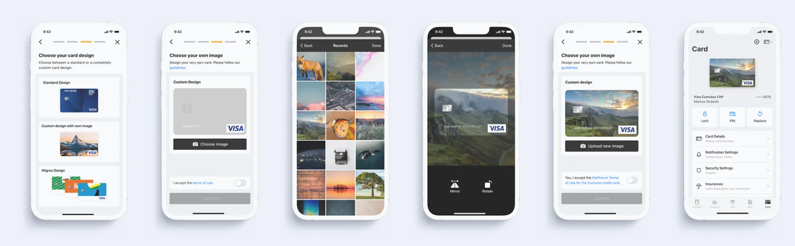
- 1 Choose card
- 2 Details
- 3 Identification
- 4 Review
- 5 Card ready
Digital onboarding
Applying for a credit card – no paper, no puzzles.
A credit card application is demanding from a regulatory point of view: identification, credit checks and legal notices are mandatory. My job was to turn that into a flow you can complete on your phone in one go.
The guiding principles: only ask what is really needed; show progress at all times; catch errors early and clearly; and translate legalese into language people understand.
With two million users there are no edge cases – only people you haven’t met yet.